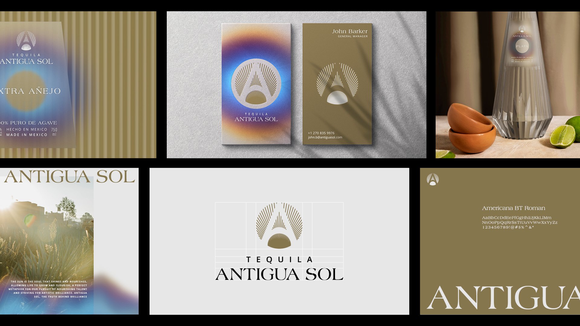

This project involved a complete rebranding of an existing tequila brand within the American market. The High Frequency Design team was commissioned to develop the rebranded identity and design elements for the packaging. The brand's narrative revolves around the idea that the sun embodies the essence of life, fostering growth and serving as a powerful metaphor for our commitment to nurturing talent and pursuing artistic excellence.
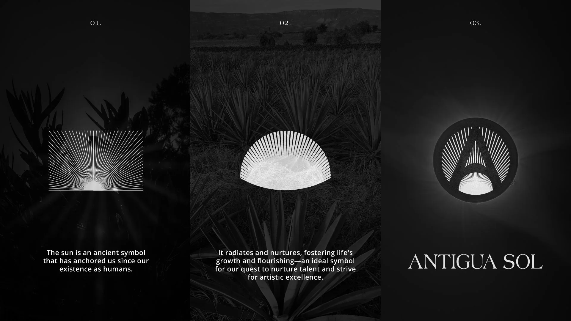
Our created logo intricately incorporates sun rays, subtly acknowledging the grooved design of the bottles. Through the clever use of negative space, the logo forms the letter A while also depicting an agave-like plant at the base, symbolising growth stemming from the sun.